
This graphic illustrating the results of a poll for the Iowa Republican primary appeared this morning on the Fox News program America Live with Megyn Kelly.
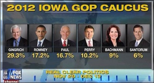
So what is Fox trying to say here? Is it that Barack Obama and Mitt Romney are interchangeable? Is this an effort to make their viewers think that Obama is losing to Newt Gingrich? Or are they just trying to confuse their dimwitted viewers so that they stumble around with vacant stares and do whatever the voices on their television tell them to do?
As I’ve said on the other many occasions when Fox News screws up: These amateurish flubs are typical of Fox’s sloppy brand of pseudo-journalism. It demonstrates their lack of seriousness with regard to reporting and informing the public. What’s more, they are aware of the problem. A couple of years ago they distributed a memo to their newsroom warning of the consequences of continued blunders:
“Mistakes by any member of the show team that end up on air may result in immediate disciplinary action against those who played significant roles in the ‘mistake chain,’ and those who supervise them. That may include warning letters to personnel files, suspensions, and other possible actions up to and including termination.”
So will heads be rolling at Fox News? Don’t count on it. Fox doesn’t regard these incidents as mistakes. In fact, they are an integral part of their mandate. A mistake would be if they inadvertently allowed something truthful to get on the air. That would be cause for termination at Fox News.

“Immediate disciplinary action?”
What do they get, a bonus or a promotion?
What a bunch of morons! They are so unprofessional it is sickening they are able to keep their FCC license. Why is that!?
Someone is wondering if there is a link to this video and, if so, can you post it as evidence?
http://mediamatters.org/blog/201112140015?frontpage
that’s a new look for the former Mass Govenor.
It seems to fit in with their “graphics challenged” department a few days ago where the figures went down but the graphics lIne went up. Seemed pretty obvious in was intentional.
That was classic. The chart actually showed that 8.6 was a higher number than 8.8, and equal to 9.0.